GET THE REPLAY OF THE VISION BOARD MASTERCLASS - LIFE IN COLOUR

Sophie Robinson
  • Home
  • Workshops
    • Marrakech Retreat
    • Home Masterclass
  • Online Courses
  • Collaboration
  • Podcasts
  • Blog
  • About
    • About me
    • Work with me
    • Press
  • FAQs
  • Contact
  • Interior Design
  • Interior Styling
  • Interiors
04 Oct 17

I want that style: The design process

HIL CURTAIN ECLIPSE DENIM ROMAN CAPRICE PARADISE SOPHIE LAND cropped

So drilling down your own look and getting your into your own style groove is something I’m really passionate about. God forbid we all follow trends and become little design auto-bots so I’m always up for helping people get in touch with their inner design guru. So when I was contacted by Hillarys earlier this year to get involved in the #iwantthatstyle campaign I jumped at the chance. The idea was to ask four very different design professionals to be involved in the design of a room scheme that reflected their personal aesthetic. I was to be joined by  Kate Watson Smyth the top blogger from Mad About The House, Daniela Tasca York the recent winner of The Great Interior Design Challenge and interior stylist and best selling author Emily Henson to be a part of a project to design a room four ways. As designers we all have a very different signature styles and so I was excited to see how this project was going to show the amazing diversity of interior design taste and style. Here we take a look at the design process.

First up I was invited up to Hillarys in Nottingham to view the new Autumn Winter Collection to pull together a series of fabrics that I think would work in a scheme of my style. I do love a sneak preview and the table in the design studio was laden with fresh new prints and plains for us to ogle at. While Kate Watson Smyth chose an oh-so-sophisticated delicate pale pink for neat Roman blinds, and left it at that, I went away armed with a bevy of clashing patterns from stripes to toile’s, florals to geometrics. Part of my signature look is to mix patterns with gay abandon and I was going to specify them for curtains, blinds and cushions. Secretly envying Kates less is more approach I know I never make it easy for myself!

Sophie robinson interior designer at Hillarys in Nottingham

Selecting fabric swatches is a key part of the design process

Back in my studio I used these swatches as a spring board to pull together a Pinterest page of inspiration. Pinterest can be a real rabbit hole but I think its most effective if you approach it with some focus. The fabrics I’d collected from were pinks and navy’s with some yellows so I used this as my colour palette while searching for relevant images. You can view my full Pinterest page here.

Creating a pinterest board is an essential first step to forming your ideas around your interior room sheme. I always do a pintererst board beforemovingonto a mood board

Researching on Pinterest is a great start

Next up I pulled out a few key images to make up my mood boards as these were going to be used by the team to design the room set. This is a good way to consolidate your ideas and make notes. You can either print out your pictures in colour and mount them to a board, or I often use an app on my ipad called Mood board as it’s so quick and easy and then I can email it off instantly to the client.

Interior designer Sophie Robinson puts togther a mood board for an interior design scheme for a pink and blue living room

First mood board captures the feel and style

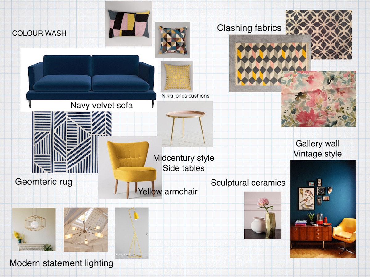
A second mood board shows product ideas


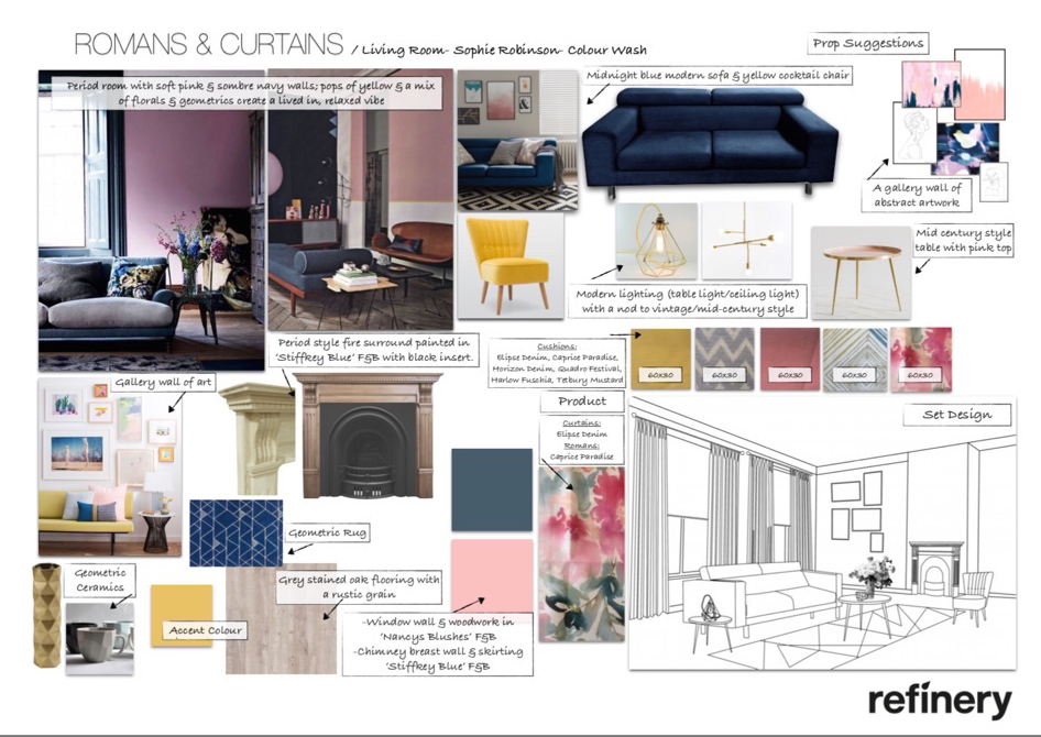
So then the photography team at Hillarys got involved in designing the room set- as well as sourcing products that were similar to my mood boards. The design board had sketches which showed how the product would be placed within the set and an idea of the angle for the photographer. It also bought together all the styling ideas and product suggestions so everyone could approve the design on paper before it all gets collated. From this board I was able to approve the design and the stylist had a clear vision of what items needed to be sourced.

An interior design board can bring togther sketches of the set, furniture options as well as paint colours and furnishing fabrics. This design by interior designer Sophie Robinson for Hillarys

The shoot was held in Manchester at a photographer’s studio, made up like a set so the rooms could be made to look identical for all four looks. Unusually for me I was’nt in control of picking out the props for the shoot or styling up the image on the day but it was a good excercise for me to hand it over and see how someone else interprets my style.


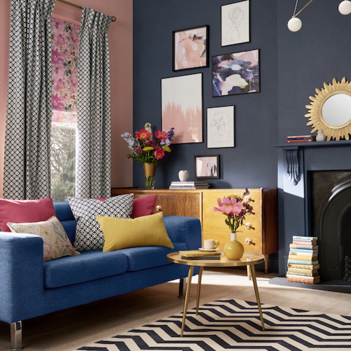
So here it is, my pattern clashing, colour loving style realised by Hillarys. Let me know what you think!

Interior designer Sophie Robinsons designs this interior designed room set in her colour clashing favourite shades of deep blue and pink. Complete with chevron rug and accents of yellow the style is eclectic and vintage. Great use of mixing fabrics

The finished room set by Hillarys

6 ways to get my signature style

1 Clash Colour. I love to clash bold colours together as they create real drama and impact. It works when you use bold colours together as you get that great burst of energy which is what I really love.

2 Mash patterns. I get a real thrill from mixing patterns together and seeing how they jostle next to one another. The way I do it is to restrict myself to a colour pallette otherwise it all goes a bit mad. Next make sure there is a mixture of large scale and small scale prints and some plains for balance. I love to mix modern gemetrics with flouncy florals so its the clash of styles that really works for me.

3 Gallery walls. I love to collect artwork and a group of framed prints all collected on one wall creates a really pleasing focal point. It also looks super striking against a dark coloured wall as the art really pops out. I talk in more detail on how to achieve this look on my How to hang art post.

4 Mix styles. The eclectic style has long been heralded as I thing but it’s at the heart of every scheme I design. I’m positively petrified of the overly matchy-matchy so I like to see different design genres and styles together as it gives a room personality. It also suits my hunter gatherer instincts as it means I can keep adding pieces over time that capture my eye.

5 Think floors and ceilings. It’s a given that colour and pattern can be applied to walls but all too often the floors and ceilings are completely overlooked. I like to show them a bit more love and always think to use the surfaces to add more colour. In my view oversized rugs (big enough so the feet of the furniture can sit ontop)  in a bold pattern are a great way to create a feature floor, and ceilings should never be white.

6 Have curtains and blinds. I love to see a window really well furnished which is why I often opt for a combinaion of curtains and blinds. Its a great way to add more colour and play with different patterns.

Further reading

For more about the #IWantThatStyle project and to see the other room sets inspired by the other designers, hop on over to Mad About the House blog here

Read my interview about the project with Hillarys here

Come and discover your own unique style by signing up for one of my colour workshops here


Save

Save

Save

Save

Save

Save

Save

Save

Save

Save

Save

Save

Save

  • Interior Design
  • Interior Styling
  • Interiors
Getting cosy for Autumn That yellow velvet sofa
  • Christmas
  • Interiors
    • colour crush
    • colour psychology
    • DIY
    • dream home makeovers
    • Home Office
    • Home Tours
    • Interior Design
    • Interior Styling
    • podcast
    • Sophie Robinson X Dunelm
    • Sophie Robinson x Harlequin
    • trends
  • Lifestyle
    • Business
    • Fashion/Beauty
    • Life
    • My House
    • Nosh
    • Travel
  • Rooms
    • Bathrooms
    • Bedrooms
    • Kids rooms
    • Kitchens
    • Living rooms
    • Outside
  • Videos
online influence award winner 2019
Interior Design Winner Sophie Robinson Insta
Videos

Listen

Listen Here

Online courses
by popular demand

Catch Sophie In All Her Colourful Glory On Instagram

January. A grateful round up. Rolling into 2026 an January. A grateful round up.
Rolling into 2026 and chasing colour in all its forms, from piercing blue winter suns to raspberry red Moroccan sunrises. I knew I’d be ready for you, 2026. And we have started beautifully.

1. A quiet promise to myself to make 2026 as colourful as possible
2. New Year’s Eve… exactly as it began
3. And then how it went. A proper sweaty dance at @alphabetbrighton 
4. Hosting a bonfire at home with friends to burn away 2025. @jothornephotography 
5. Watching embers glow beneath a full moon. Emotional in the best way
6. Snow, low sun and the most perfect winter palette
7. Still walking it out! Bracing the cold with @sophieabbottartist @edwinaboase 
8. A much needed colour hit, hosting my interiors retreat with @elfennmarrakech 
9. Me and partner in crime @em_lappin  at @lallamarrakech 
10. The joyful jolt of colour only the Marrakech souks can deliver
11. Discovering the new @ritaalaoui_artist art installation at El Fenn
12. New moon meditation with the wonderful @alexadecastilho 
13. Gently shaping a new vision for 2026
14. Harnessing that wild horse energy for my vision board webinar
15. Proud moments unveiling my latest collection to the press at @dunelmuk 
16. Catch ups with my lovely TV chums @hardcastletowers @francescarowanplowden @jackkinsey @ritamillat 
17. Feeling genuinely excited about this collection and all the squeals it is delivering
18. Finally ticking off my 360 health scan at @nekohealth 
19. Becoming mildly obsessed with pastel, colour drenched interiors
20. It looks busy, but January has mostly been this. Rest. Reflection. Happy wintering.
Not going to lie, this might be one of my proudest Not going to lie, this might be one of my proudest makeovers ever…
My Dad and Mary’s modern French villa was all beige tiles, white walls and zero personality. So I did what I do best: turned it into a technicolour dreamscape inspired by the countryside views outside those gorgeous bifold doors.

Inspired by early  autumn leaves, emerald green fields, and piercing blue skies we set about making the inside of their home feel as joyful as the outside … now imagine all that bottled up into wallpaper, fabrics, cushions and colour-drenched furniture.

If you’ve ever thought bold colour overwhelming or that pattern was too much for open-plan spaces… this one’s for you. Because colour and pattern sings in nature, and it can work just as well in your home decor.

All wallpapers, rug and cushion fabrics are from my collection with @harlequinfw. Painting by @sophieabbottartist 

Full sourcing list, extra styling tips and a deeper dive into the design story are up now on A Life In Colour: head to my Substack via the link in bio to read more!
End of January check-in… and yes, the struggle to End of January check-in… and yes, the struggle to stay joyful is very real right now. Dark mornings, grey skies, energy running low.

That’s exactly why our homes matter so much at this time of year. They are our sanctuary. The place that should lift your mood, calm your nervous system and make you feel held when the outside world feels a bit, how can I put this...relentless. And this isn’t just a feeling or a design philosophy. It’s backed up by science. Research shows that colour, light, beauty and nature in our homes have a direct impact on mood, wellbeing and happiness. Small, intentional changes really can shift how you feel day to day.

I’d love to know… what brings you the most joy in your home right now? A colour, a room, a plant, a view, a ritual? Share it in the comments 💛

And if you’re ready to go deeper, my big January Sale ends this week.

If you want to truly understand colour psychology and learn how to curate a home that feels joyful, confident and completely you, comment ULTIMATE and I’ll send you the link to my online design school and your opportunity to make the biggest saving of the year.
These are the ingredients to making your home feel These are the ingredients to making your home feel as good as it looks. 

• Confident colour that creates the mood
• Beautiful pattern that delights the eye
• Layered texture that brings it all alive
• Personality in every corner, so it feels like home

Magic happens when you stop playing it safe and start designing a home that truly reflects you. A home that feels joyful, expressive and alive. But designing a home can feel overwhelming. Where do you start? How do you combine colours without it feeling chaotic? How do you clash patterns so it looks considered? How to express your unique personality without merely copying other people’s style?

That is exactly why I created my online design school. After more than 25 years as an interior designer, I have distilled my design process into clear, easy-to-follow courses that take you step by step through combining colours, balancing patterns and adding texture, so you can decorate with confidence and creativity.

And right now, my January Sale is on. You can save a huge 60% on my transformational courses, designed to completely change how you approach your home and how it makes you feel. If you are ready to embrace your creativity and deepen your passion for interior design  comment ULTIMATE and I will send you all the details.
Think Maximalism is ‘too much’, too messy, or only Think Maximalism is ‘too much’, too messy, or only for other people? 

I’m here to tell you: maximalism isn’t chaotic. It’s just misunderstood.

Once you understand how colour and pattern work together, decorating like a maximalist stops feeling intimidating and starts feeling instinctive. Your home starts feeling like you.

If you want to design your home with confidence, my Ultimate Interiors Bundle is exactly what you need. It includes three self-paced online courses that take you inside my design process, teaching you how to use colour and pattern so you can make bold choices that actually work, again and again. 

Right now, the Ultimate Interiors Bundle is a massive 60% off. Buy now, enjoy the saving, and start whenever you are ready to create a home that is completely yours.

Comment ULTIMATE and I’ll DM you the link to find out more.
Welcome to my witchy era! Who else wants to harnes Welcome to my witchy era! Who else wants to harness the Year of the Horse and use this dynamic energy to manifest your best year yet! 

A vision board is like a compass that will lead your goal settings and intentions with total clarity. To prepare i like to take lots of long walks and meditate on what it is so want more of in my life while gratefully letting go of what no longer serves me. 

Join me Wednesday for a live webinar on how to I create a Vision board that will ignite your passion and motivation to live a bold, creative and colourful life! Comment VB26 for the link.
Dark and moody colours can feel intimidating, but Dark and moody colours can feel intimidating, but my TV snug shows just how well they can work. The deep tones soften the space and create a calm, cocooning atmosphere, perfect for evenings spent watching TV, or retreating from the day.

Contrary to what you might think, this room really comes into its own in winter. Low light and long evenings make the colour feel enveloping and cosy. It’s a space that invites you to slow down, sink in, and make yourself comfortable.

I sampled so many different paints but Cordoba by Little Greene was the perfect choice for this room. It’s full of depth and warmth, and just the right amount of drama. 

And if you’re thinking about taking the leap yourself, my tip is: don’t fight the natural light you have, lean into it. Don’t be shy about colour drenching walls, woodwork and ceiling so the room feels seamless and intentional. In my snug, that richness is what makes it feel cosy and complete.

There’s no place I’d rather be on chilly evenings.
How do I explain this feeling to a minimalist? To How do I explain this feeling to a minimalist?

To some people this might look like too much, but for me, maximalism isn’t excessive, it’s pure self expression. I decorate my home to reflect the way I live and that’s full of bold uplifting, joy-giving colour. Every patterned textile, every artwork, every joyful little object earns its place because it makes me feel happy. 

And if I’m being honest a neutral room doesn’t make me feel calm, it makes me feel slightly depressed. My home lifts my mood, fires my creativity and gives me a little thrill every single day.

Now tell me… are you Team Minimal or Team Maximal? And what makes your heart sing at home?
Follow on Instagram
Sophie Robinson
  • © 2025 Sophie Robinson

    /
  • Contact/
  • About/
  • Design by MW

You're almost inside!

Leave me your best email to sign up for the Webinar

MG0001 Magnet Sophie using Tap 021 copy

You're almost inside!

Leave me your best email to sign up for the Webinar